
Tonal Checkerboard Flooring Trends
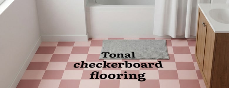
Tonal Checkerboard Flooring Trends
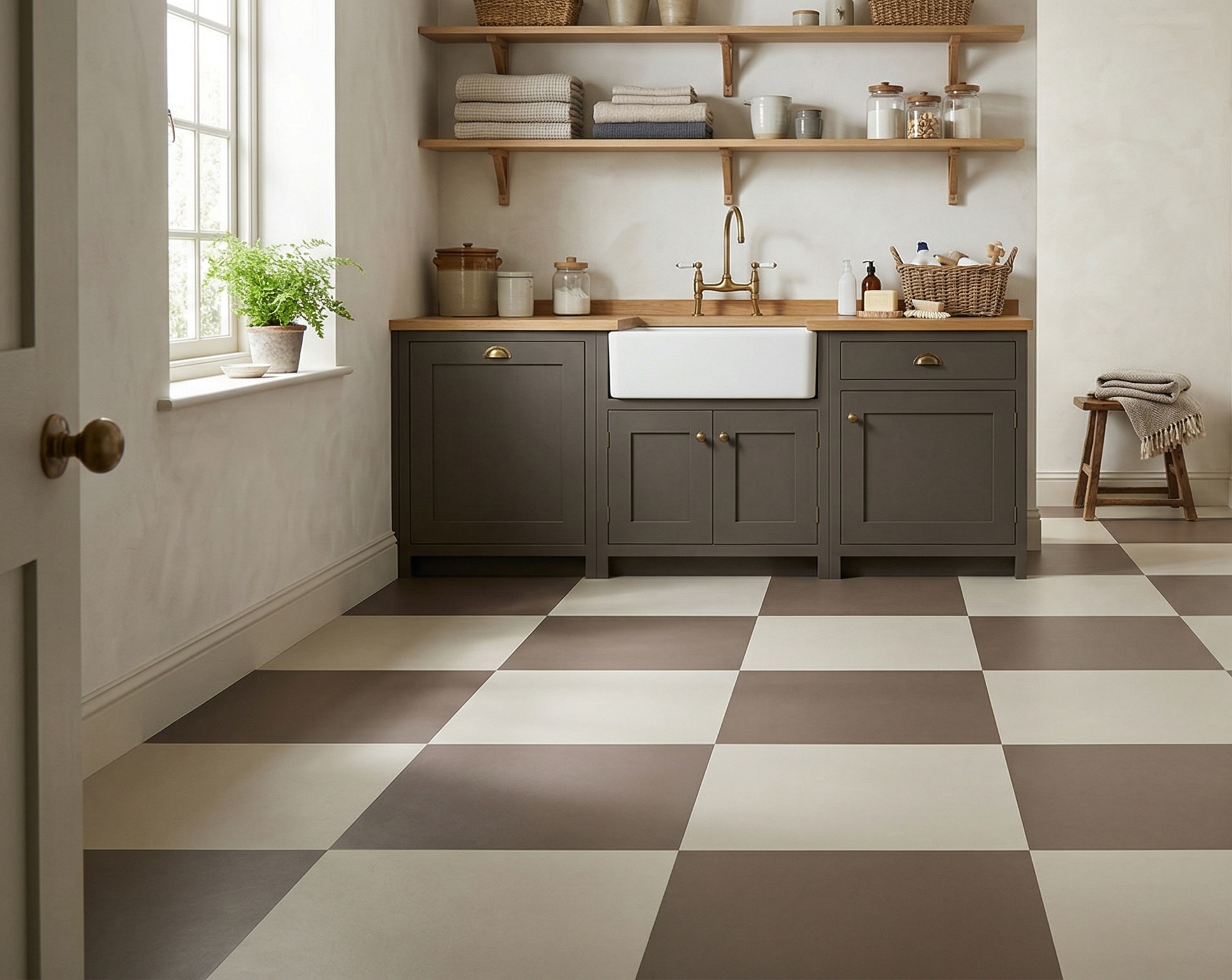
If it’s the softer side of checkerboard that keeps catching your eye, the useful question is what you want the two colours to do in your room.
They might sit very close together — chalk and clay, sage and olive, mushroom and oat — so the squares are there without taking over. Or you can leave a little more distance between them when you want the floor to make itself known.
Then there’s the size of the squares and the direction they run. Those choices can change the feel of the floor just as much as the colours do.
Start with what is already happening in the room. The cabinetry, wall colour, timber, tiles or one shade you know you want to keep can give you the starting point.
What makes a checkerboard feel tonal?
It isn’t one particular colour palette. It is the relationship between the two colours, the scale of the squares and how strongly you want the pattern to read across the room.
Colours that sit close together
When the two shades are fairly close, the checkerboard becomes much softer. You still get the rhythm of the squares, but the contrast doesn’t dominate everything around it.
Warm and earthy
Putty, clay, mushroom, oat and muted terracotta can make a checkerboard feel settled rather than stark. They work particularly well beside timber, warmer paint colours and natural finishes.
Fresh and quieter
Soft grey, chalk, pale blue-green or sage can make the same geometry feel lighter. Useful when you want the structure of a checkerboard without a hard black-and-white contrast.
Square size matters
Bigger squares give the pattern more room to breathe. Smaller ones create more repetition and detail. Neither is automatically right for a particular room — it depends on how much floor you will actually see.
Straight or diagonal
The same two colours can feel quite different when the grid changes direction. A straight layout can feel calm and ordered; turning the squares can bring a little more movement into the room.
A little more contrast
Tonal doesn’t have to mean barely-there. Give the two colours more separation and the floor becomes stronger while still feeling softer than a classic black-and-white check.
Make the checkerboard fit the room, not the other way round
You may already know the cabinet colour. Or the paint. Or the stone you want the floor to sit beside.
With Chess, those things can lead the floor rather than forcing the rest of the room to work around a fixed black-and-white design.
The useful choices are surprisingly simple.
See what a softer checkerboard does in a room
A colour square tells you very little on its own. Across a whole floor you start to see the rhythm, how strong the contrast really feels and what happens when the checks meet cabinetry, timber, tiles and wall colour.
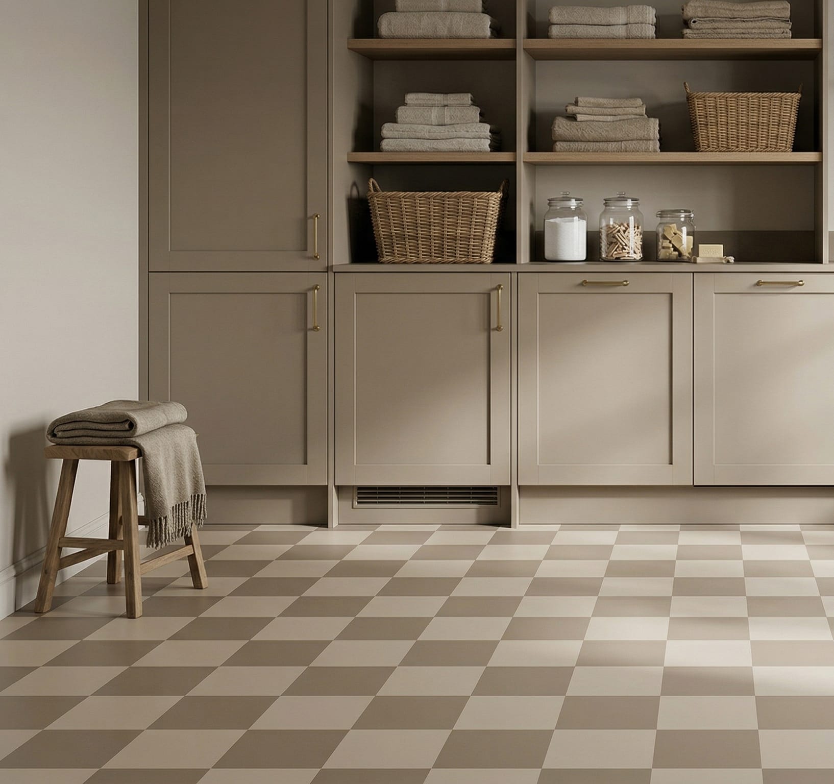
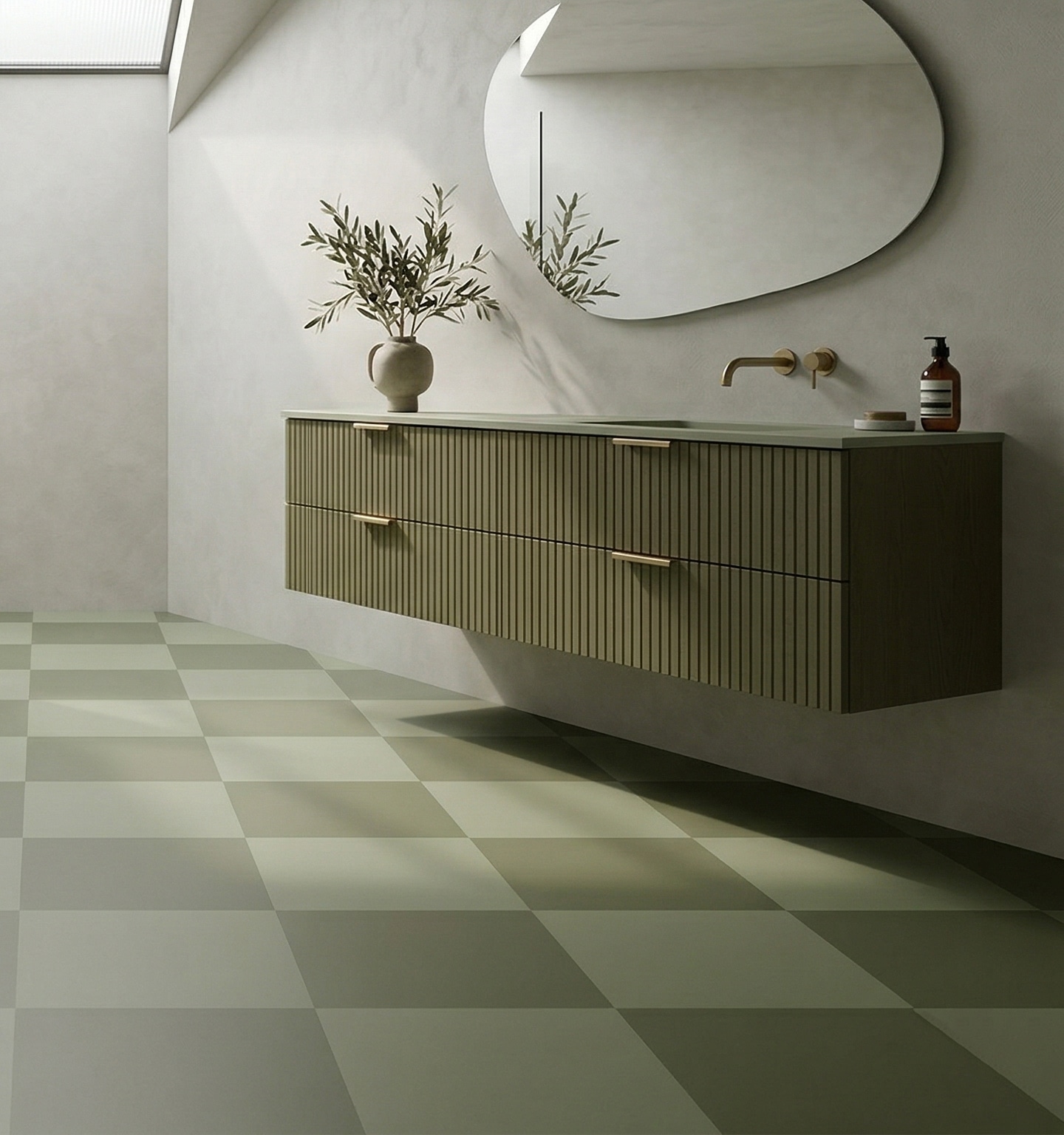
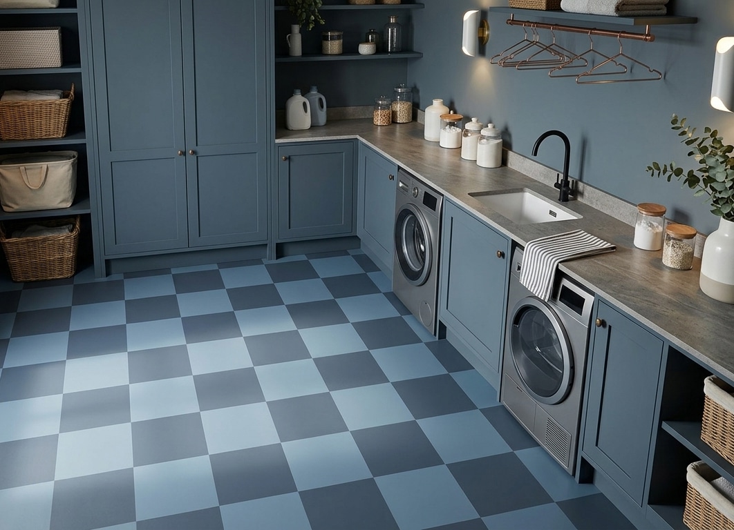
Start with the room you’re changing
If it’s the kitchen
Start with what the floor will sit beside. Cabinet colour, timber and worktops can all give you one of the two shades without needing to repeat the whole palette everywhere.
A softer checkerboard is especially useful when you want the floor to have structure but there is already plenty happening above it.
If it’s the bathroom
Bathrooms often leave a useful amount of floor visible, which makes the spacing and scale of the squares worth thinking about.
If the tiles and fittings are quiet, the checkerboard can carry more of the room. If there is already plenty of contrast, bringing the two floor colours closer together can calm things down.
And if it’s a smaller room?
Don’t automatically make the squares smaller because the room is small. More squares can sometimes make the floor feel busier simply because you see more repeats.
Look at how much floor will remain visible once everything is in place. A larger or more open check may give the pattern more breathing space, and changing the direction can alter how the room reads too.
The useful things to know
Once the colours and scale are starting to feel right, these are the useful bits.
Start with the colours you already have
A screen can help you find a direction, but the useful test is what the colours do beside the things already in your room.
You can order a sample of Chess to see the material and standard design at home. If you want to change the colours, square size or direction, we can work that through before production and show you the intended result in your proof.
A few practical questions
Can the colours in Chess flooring be changed?
Yes. Chess can stay as shown, or the two colours can be changed, at no extra cost. A paint reference, photograph or sample is enough to work from, and we match it as closely as the materials allow. An exact match cannot be guaranteed. The intended colours are shown in the proof before the floor is produced.
Can the size and direction of the checkerboard be changed?
Yes. Chess is one of the designs where the size of the squares and the direction of the grid can be adjusted. Changing the scale is at no extra cost. The proof shows the intended scale and layout before the floor is produced.
Can tonal checkerboard vinyl be used in kitchens and bathrooms?
Yes. It is sheet vinyl, and it can be used in kitchens and bathrooms when correctly fitted over a suitable clean, flat and dry subfloor. It has an R10 slip-resistance rating.
Found the kind of checkerboard you’re leaning towards?
You don’t need to settle every detail from the screen. Start with the colours that already feel right for the room, decide whether you want the checks to sit quietly or make more of themselves, and we can work from there.