


Spring into action! The 3 Simple Colour Schemes That Work In Any Room!
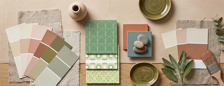
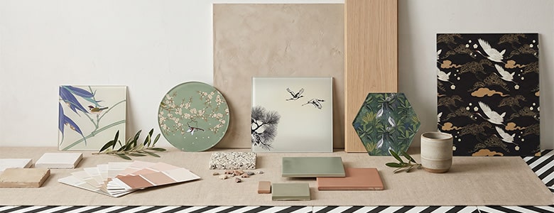
When the decorating bug comes rolling back around and I decide to take on a room at home, out comes the mood board and on it goes the first bursts of ideas and inspiration.

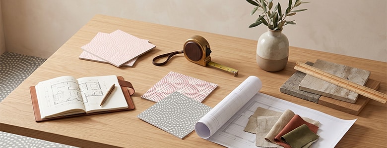
I use a folder and print out pics from Pinterest and décor companies, clippings from magazines and the newspaper glossies. Anywhere an idea can come from goes in and slowly they start to crystallise and my new theme or style starts to grow.
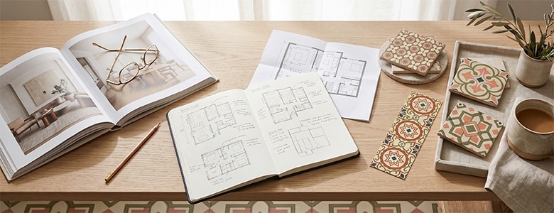
Normally there can be something that may be just too big or costly to change – carpets or the bathroom suite – but usually, there’s the initial room hero and then from there a cohesive style starts to gradually emerge.
Colour wheels are a great resource for inspiration and a guide for what works – I like the Adobe colour wheel here. Start playing with colours and hues to see what works and what fits alongside the snippets in your mood board.

When using a colour wheel, or even earlier and right at the beginning as I start to work through ideas and formulate the board, the 3 colour schemes or rules I use to develop the room theme are:
- Complementary
- Harmonious
- Tonal

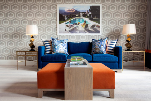
Complementary colour scheme
Looking at the colour wheel, complementary colours are the ones that are at the opposite sides to each other. They contrast and create life and impact within a room’s décor. Think red and green or blue and orange. Colours that when coupled together breathe drama and daring.
Get them right and they seriously add the wow factor. Get it wrong though and they can be difficult to live with. Remember that complementary colours when placed together make each other appear much more intense so it can be wise to pick the next shade down when you’re looking at paint pots.
Play it safe by gradually bringing in items of the two main colours and see how you live with them and how the space feels. Give it time and you’ll move it up a notch I’m sure!
For a real feeling of luxury and opulence, connect deep resonant purples with a yellow accent and the vibrancy is stunning. Even lighter shades – think lilac – can still create a wonderful effect.


If your inspiration is for the most daring, complementary colours are dramatic, bold and add depth to any room. I love working with complementary shades and tones but I know they’re not always for everyone or every room.
If it appears a little too much, bring in a neutral white or cream for part of the décor to lessen the drama a tad, get used to it and then turn it back up to 11!
Harmonious
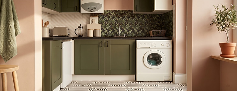
These are colours or tints and tones that are next to or near to each other on the colour wheel. Think blues and violets, yellow and greens.
By using two or three close colours, a collective feeling can be generated – greens and yellows for a soothing yet playful theme, blues for a calm and peaceful feel. Harmonious or analogous colour schemes work especially well in bedrooms for their possibilities to create a sense of serenity and tranquility.
I like to use harmonious colours throughout a room for the walls, floors and paintwork, then add some contrasting colour for accessories or soft furnishings. It can look really effective by adding a complementary coloured cushion or accent on a rug to an overall harmonious room. It’s a simple way to inject an element of your own individual character.
There are some good tips on the BBC Homes site:
- Choose colours of similar densities for a balanced look so one doesn’t overpower another.
- Pick three or four colours that all stem from the same primary colour.
- Make the scheme bolder by going for a deeper more intense shade.
- If one of your harmonious colours happens also to be a primary colour the effect will be more striking. For example, red and hot pink or red and orange.


Tonal colour scheme
Go back to your mood board – is there a slant towards a single shade or colour? Are you thinking cool blues or dusky pinks?
A tonal scheme takes the main colour as its backbone inspiration and then uses different variations of this colour throughout the room. Thinking of blue then how about navy, sky and pale?
Don’t use too many shades as it will lessen the feel and look jumbled and mismatched but three or four variations can really create a sense of threaded style throughout your room. Use the deepest colour closest to the floor and the lightest on the ceiling to convey space and openness.
Tonal schemes are also called monochrome as they utilise a single colour as the foundation and by changing this colour’s tone, the décor and atmosphere is developed. I love to see this colour scheme infused within an industrial home decor room theme – it looks incredible!
In the lingo of the colourist:
- Tint: The act of lighting a colour by adding white to it.
- Shade: The act of darkening a colour by adding black.
- Tone: Slightly darkening a colour by adding grey.


Finishing touches
When using any of these colour schemes, I always keep in mind the 60/30/10 rule.
Visualise your room and think about 60% of it covered in your main dominant colour. This may be the main wallpaper colour you’ve picked, the paint for the majority of the walls or the carpet shade.
The 30% is for your secondary shade – maybe a lighter or a different shade. The final 10% is for your accent colour that depending on which scheme you’ve picked, will either compliment or contrast.
Another good tip I use is to bring in a little element of white or black to add a spark of sophistication to your room. The addition of a black and white geometric cushion or rug or a dark picture frame for a print can often really help tie the other brighter more varied colours together.
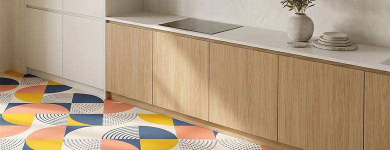
Bear in mind that these colour schemes or rules apply to anywhere in the home. By using your initial room hero or object that ignites your newfound enthusiasm, the same principles can help when picking anything from wallpapers, flooring, splashbacks for the kitchen, or something innovative like our new range of Feature Tiles.
These are the three main colour schemes and starting points I use when working though room décor ideas. Hopefully, they will help you with your own projects and I look forward to hearing about your inspiration on our social media.
Please subscribe to the newsletter over on the home page and we’ll keep you up to date with posts and information as we try to help with making your home more beautiful.
Louisa
Pattern designer, product creator, and white coffee with no sugar drinker at For the Floor & More
Patterned Vinyl Flooring – All New Styles To Shake The Floor Under Your Feet How to Fit Bespoke Wallpaper Murals